Last week I signed books at a homeschool conference in Ohio. It was my first opportunity to sell print copies of Neverqueen, my newest release. One thing I noticed: people did not “fall in love” with that book when they looked at the cover… And that is the first time that has happened for me with ANY of my books.
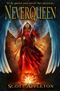
It turns out that many people just don’t love the cover (my wife and my mother among them). Some people at the conference even thought it looked creepy and evil! Obviously this is not the mood of the story and not the impression I want to leave with prospective buyers. This is an epic fantasy tale with a bit of a mystery, too.
For that reason (and so that it will tie in better with the style of The Sword of the Dragon covers) I am seriously considering commissioning a new piece of art to completely change the look and feel of this work. I love the story and I know readers will, too, but we need a cover people want to set on their book shelves.
I do not want to be one of those authors who cannot take criticism and learn from it, even change things to improve them. This cover is one alteration that I think is needed.
Question: Do you love the Neverqueen cover? Does it draw you in? How does it compare to the other covers in The Sword of the Dragon series?


I really like the colors within the cover. The red of the dress, the glow, the wings are vibrant and catching….but the eyes. I think it comes down to the eyes for me.
There IS a “creepy” feel to it but I don’t think I thought too much about it.
“Mom” 😀
Hmm… so this means both of my mothers don’t care for it. Definitely sounds like a rework is in order.
As a big fantasy fan, I personally like the cover. I could change some things about it, like the white eyes and facial expression. I think those parts are what makes it creepy (my family, too, says the cover is scary). I definitely think that the cover should be in par with the Sword in the Dragon covers. Look at Key of Living Fire for an example. There’s a huge evil dragon with a man holding a flaming key with crumbling stone beneath them. The color of the cover was dark, but it came across as epic and cool and not scary. So, overall, I think it would be a good idea to change the cover to draw more people in. One cool idea is to have Turser’s mountains (which could be dark and gloomy) on the top half of the cover, while the bottom half shows the Eiderveis River and its inside (like a paradise). Violet could be in the river with her back shown (wings spread), looking toward the mountains, showing confidence. The Wee Mermaids could make an appearance, too. 🙂 It’s a thought, but I just wanted to share it to get an idea of a cover I know that would draw me in.
I really love this idea. I am still thinking it over but the whole idea of Violet looking out over the Eiderveis (with Turser’s Mountains in the background) has a lot of appeal. That would be beautiful.
I have to say I agree with Joseph. After she saw the cover, I had to explain to my mom that it was a book by the same author as The Sword of the Dragon series before she let me buy it 🙂 . And a cover that ties in with the rest of your books would definitely be an appreciated change.
Joseph’s cover idea sounds like an awesome replacement! (Done by the right artist, of course 🙂 )
Thanks for your honesty there. It is important to me to know when something like that is going on. That was part of the reaction I saw at the homeschool conference…. It will be a considerable cost to effect this change so it may take a little while, but I do intend to get a new cover for Neverqueen now that I know it is hurting the book’s reception.
I love the cover. I think the sharp, realism of the image combo-ed with the pull of the scary eyes and boniness of the lady makes the book feel like it’s intended for a more mature audience than most of your readers and probably interested in.
I dig the image, but as is it’s focused on the scariness I think. Next to your other books, I’d pass over this one. The other covers are gorgeous. I haven’t read the book so I can’t give a suggestion, sorry!
But it may not be the cover that’s slowing sales. When YA readers have a choice between a series and a stand-alone…they go for the series. Hopefully, the other books will draw readers to Neverqueen.
Thanks Nathan! BTW nice to see you’ve migrated to the new website (-:
It is valuable to receive your feedback here because I want to know what the perception of potential readers is, and both of your perceptions were incorrect. First off, the story is not darker and will appeal to the same readers. And secondly Neverqueen is part of The Sword of the Dragon series; it is an expansion story world that so far looks to be at least a twelve book series. This is only the first book. Book two should be out Christmas 2014 if all goes according to plan.
First off I enjoyed the book, cover or no. Now, I did feel that the cover was something uncharacteristically dark compared to your other novels. The novel itself didn’t feel overly dark or ‘evil’ to me, so the cover did give me an incorrect preconceived idea before I opened it. The cover for ‘Swords of the Six’ is one of the best I have seen in the fantasy genre in a long while and I liked the covers of your other works as well. The ‘Neverqueen’ cover wasn’t terrible by any means but I would say darker than it perhaps needed to be.
Keep up the great work!
Yes, your feedback only compounds my feeling that this cover needs a makeover. And it is especially helpful to hear that you read the book and felt the cover’s mood did not match the story.
What do you think of Joseph Ely’s cover suggestion?
To be honest I like it and don’t. I like the set up of the Sword of the Dragon covers, but with Neverqueen being a new off-shoot series within the Sword of the Dragon world I think the cover sets the book apart.
When I first saw the cover I was intrigued as to who the character was, why she was throwing down this sphere, which to mean had to have some magical properties, and it did pull me interest to find out if your book would explain the cover picture.
In the end I love it for the intrigue it brought me into peaking my interest in the story. I’m a but OCD when it comes to series and covers. If the cover changes in the middle of a series I like the uniformity of the same theme for covers. But I will say I won’t be against it if you decide to change the cover, but that just means I’ll have to make sure I buy the book again with the new cover if you change it, lol!!
Thanks for your feedback! LOL I will think hard before committing the funds to this re-do. Good fantasy art is not cheap!
I do agree with it needing a new cover. I have loved all your books and have many kids reading and learning from them. The queen in the book is a good queen but the cover seems to portray a evil type persona. If I had not known of you work and your love for Jesus I would have passed it by. The cover would have left me with the impression it was a darker book then I am willing to read. Sometimes you can’t tell a book by its cover. :-). That being said first impressions are important. Be we’ll and God bless Scott.
Hmm… your reaction reminds me of other responses I have seen. And they do not have a positive outcome on the book’s marketability. I do believe a good cover greatly aids a book’s sales and I do want to entice the readers from my primary series. Thanks for the comment! Most likely I will change the cover.
Well, I must say the Sword of the Dragon series covers ARE beautiful … I mean – they’ve got DRAGONS on them! And I love the color schemes. I do like them better than the Neverqueen cover, but that doesn’t mean I DON’T like the Neverqueen cover. I was definitely attracted to it when I first saw it, before I even read the premise. That’s me, though, and I’m fairly easy to please … I can see more conservative readers/parents/children wondering if the darker look of Neverqueen will translate into a darker story as well.
I do want the Neverqueen cover to have that WOW effect that my first three covers have. Seems to me another nail in this cover’s coffin. Oh well, as an author I live and learn!
Well, if it helps, my book’s cover is much worse 🙂 Haha. The problem is that I had very little input in how it looked to begin with, and I have next to no authority to change it now! It is the product of one of those small publishers you spoke of in another post, who make second-rate covers. Although I most definitely don’t intend to bash my publisher or their decisions, it’s obvious the originality and polish just aren’t there. The cover of Neverqueen, on the other hand, has BOTH of those things, if you ask me! The only reason I can see that you’d need to change it is just to reflect the “mood” or theme of the actual story more accurately. But you’re right … you definitely live and learn. I plan on being more forthright about my own cover ideas in future, that’s for certain 🙂